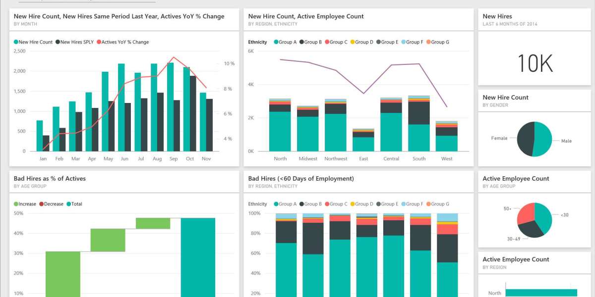
In the modern business landscape, data is one of the most valuable assets an organization can possess. However, raw data alone isn’t enough; it must be transformed into meaningful insights that drive decision-making. Power BI, Microsoft’s powerful business analytics tool, enables users to create visually engaging dashboards that simplify complex data. In this article, we’ll explore the concept of a Power BI sample dashboard, its key components, and how to effectively utilize it for data analysis.
What is a Power BI Sample Dashboard?
A Power BI sample dashboard is a visual representation of data collected from various sources, designed to provide a quick overview of key metrics and performance indicators. It serves as a snapshot of an organization’s performance, allowing users to monitor trends, identify areas for improvement, and make data-driven decisions.
Key Features of a Power BI Dashboard
Before diving into sample dashboards, it’s essential to understand what makes Power BI dashboards effective:
Interactive Visualizations: Dashboards in Power BI can include charts, graphs, maps, and tables that allow users to interact with the data. This interactivity helps in exploring different dimensions of the data.
Real-Time Data Updates: Power BI dashboards can be set up to refresh automatically, ensuring users always have access to the latest information.
Customizable Layouts: Users can tailor dashboards to meet specific needs, adding or removing visual elements based on relevance.
Data Integration: Power BI connects to various data sources, including databases, cloud services, and spreadsheets, allowing for comprehensive analysis.
Sample Dashboard Ideas
Here are several sample dashboard ideas that can be implemented in Power BI, catering to different business needs:
1. Sales Performance Dashboard
A sales performance dashboard provides a comprehensive view of sales activities, enabling sales teams to monitor their performance effectively. Key components might include:
- Total Sales: A KPI card showing total sales figures against targets.
- Sales by Region: A map visualization highlighting sales distribution across different regions.
- Top Products: A bar chart displaying the best-selling products.
2. Financial Overview Dashboard
This dashboard gives finance teams a quick look at the organization’s financial health. Important metrics could include:
- Revenue and Expenses: A stacked area chart comparing revenues and expenses over time.
- Profit Margin: A gauge showing current profit margins against targets.
- Budget vs. Actuals: A clustered column chart comparing budgeted figures to actual results.
3. Marketing Campaign Dashboard
For marketing teams, this dashboard helps track the effectiveness of various campaigns. Key metrics might feature:
- Website Traffic: A line chart showing website visits over time.
- Conversion Rates: A funnel chart illustrating the customer journey from awareness to conversion.
- Social Media Engagement: Pie charts depicting engagement levels across different social media platforms.
4. Customer Insights Dashboard
Understanding customer behavior is crucial for any business. A customer insights dashboard can include:
- Customer Demographics: A pie chart showcasing the demographic breakdown of customers.
- Customer Satisfaction Scores: A gauge displaying average satisfaction ratings from surveys.
- Churn Rate: A line graph tracking customer retention and churn over time.
5. Project Management Dashboard
For project managers, this dashboard aids in tracking project progress and performance. Essential components could include:
- Project Status: A Gantt chart illustrating the timeline and status of ongoing projects.
- Resource Allocation: A bar chart displaying resource allocation across different projects.
- Budget Tracking: A visual comparing actual vs. planned budget for each project.
Best Practices for Creating Power BI Dashboards
To maximize the effectiveness of your Power BI dashboards, consider the following best practices:
Define Clear Objectives: Before designing a dashboard, determine what insights you want to gain and who the target audience is.
Keep It Simple: Avoid clutter by focusing on key metrics. A clean, uncluttered dashboard is easier to interpret.
Use Consistent Visuals: Maintain consistency in colors, fonts, and styles to enhance readability and user experience.
Enable Interactivity: Incorporate slicers and filters to allow users to explore the data and gain deeper insights.
Test and Iterate: Regularly review and update your dashboards based on user feedback and evolving business needs.
Conclusion
Power BI sample dashboards are powerful tools that transform data into insightful visualizations. By leveraging the features and capabilities of Power BI, organizations can create dashboards that not only facilitate better decision-making but also enhance collaboration across teams. Whether it’s tracking sales performance, monitoring financial health, or analyzing customer behavior, a well-designed Power BI dashboard provides the clarity and insights needed to drive success in today’s data-driven world.


